


How Poppy Barley embraced change by rethinking everything.
If Shakespeare existed today, perhaps he would have posed the question, “what’s in a brand?
” In 2018, the idea of branding has eclipsed commerce, becoming increasingly more vital for everyone from social media influencers, small business owners, and even everyday professionals looking to stand out in a crowded job market.
It’s not just about what you are selling, saying, or promoting, it’s how the public perceives it that matters.
Six years after selling their first pair of boots, Poppy Barley felt that the time had come to reevaluate its look and feel.
While still in its infancy compared to other companies in the same space, throwing out familiar iconography in favour of something entirely new is both scary and dangerous for a fashion brand that has amassed a large (and ever-growing) following.
But failing to honour the growth and development of the brand would be disingenuous to the spirit of a company that has never shied away from doing things differently.
“After 6 years of discovery and learnings, we’ve grown into a company very different from where we started,” says Monica Gault, Poppy Barley’s Director of Design and User Experience.
“We quickly became so much more than our early value proposition of offering customers with fit issues a footwear option.
We are making great shoes, in a much better way, and the way we represent ourselves to the public needed to showcase that. As we made milestone business decisions, the company values revealed themselves and we transformed into a powerful movement and community. The face of the company has desperately needed to represent all the amazing things happening below the surface, so in 2018 we tackled a rebrand.”

Understanding Your Brand
Taking the time to question the intention behind your brand is an essential first step that is often overlooked in the excitement of selecting a logo or company colour.
If your inspiration is too reliant on trends, you lose out on longevity and can end up getting lost in a mass of millennial pink and pineapple silhouettes.
On the other hand, striving for a brand identity that is overly niche and obscure could mean alienating your audience.
The sweet spot is in the authentic representation of you or your product because when it comes down to it, genuine and honest communication is what resonates with an audience.
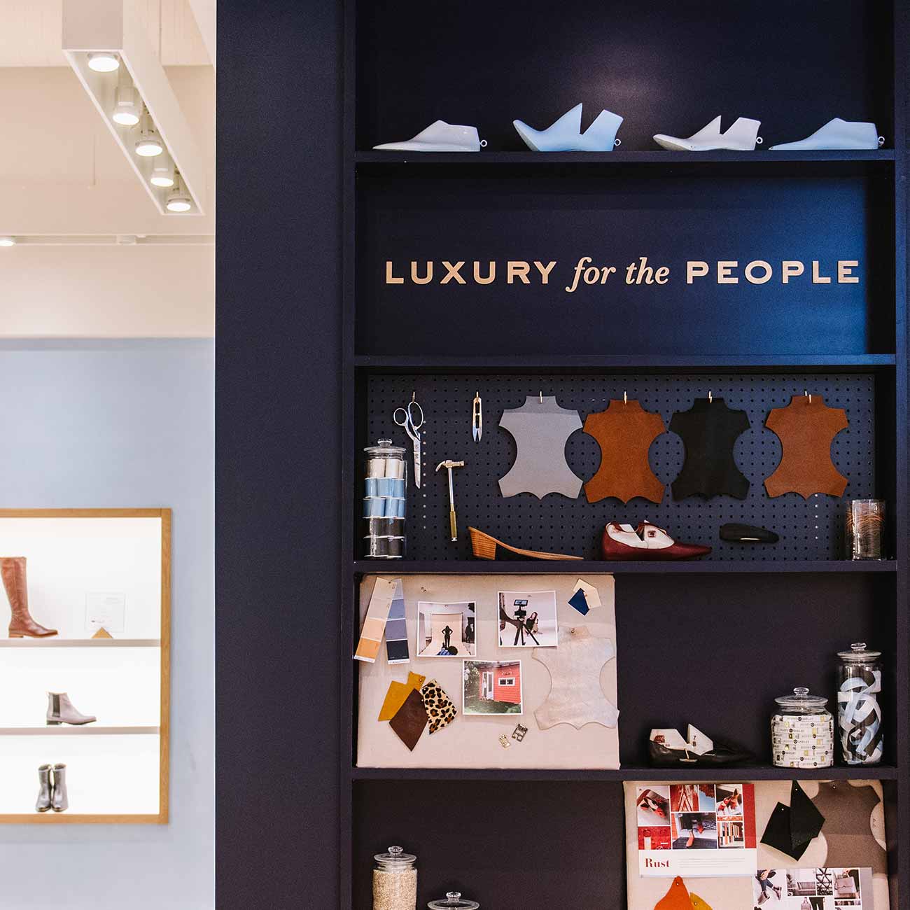
The Poppy Barley rebrand was a multi-layer thought process, culminating in the redesign of the company’s Edmonton, Alberta Flagship, an overhaul of the website, and an entirely different logo, typeface, and refreshed brand colours.
Much more than a simple text re-do, the rebrand permeated every aspect of the outward representation of the company.
Regardless of size, reach, or resources, finding success in developing a brand’s identity is about determining what makes it different, and then understanding the best way to showcase it to a larger audience.
This process of diffusing mission and vision statements into a brand identity is something that Poppy Barley has learned and honed over the years, ultimately guiding how they approached tackling the rebrand.
“The Poppy Barley brand innately disrupts conflicting priorities: essential style and all-day comfort, social responsibility and fair prices, traditional craftsmanship, and a future-oriented shopping experience.
‘Luxury for the people’ could not be a more accurate ethos for our brand, as we redefine the standard by which Canadian brands need to start doing business—putting people at the center of every decision made and ensuring the experience we provide them is exceptional from start to finish.
”
 But before any of these changes made their public debut, countless hours of debating, discussion, and agonizing over the minute details went into the new expression of the brand, much of it helmed by Gault herself.
“In our rebrand, we believed it was of utmost importance to let our product and community take center stage and not lose that vibrancy.
We needed a visual identity that would not compete, but complement who we are. Refined but approachable, soft but strong, experimental but subdued. Our new brand captures the confidence of our company to take on the world honestly and to redefine Canadian retail so that our people—from maker to customer to fans—can have it all.”

The Brand is in the Details
The two-dimensional elements of a rebrand can go unnoticed to casual fans and passersby, but nailing down the textual and graphic expression is no less important.
It’s also a far less costly endeavour than a massive remodel and renovation, making it more achievable and feasible for a smaller startup or independent business or artist to undergo.
That being said, hours of thought, trial and error, design (and redesign) will need to go into the final product before achieving success.
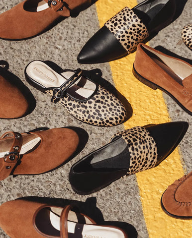
 The former slab-serif font that became Poppy Barley’s default has been replaced with a more refined typeface.
Capturing the contrasting sentiment of "Luxury for the People", the thick and thin strokes of the type feel significant to the brand story—sturdy, honest and confident while being thoughtful, precise and elegant.
The original teal brand colour was tossed out in favour of a new palette of shades of blue and varying opacities of peach.
The final result is something that captures the essence of what the new identity of Poppy Barley is—more style-driven, unisex, modern, and entirely its own thing.
“Visually fusing worlds that can be at odds is not a simple task, but we realized how much of what our brand stands for is captured simply by looking at the exclusive products we are making, the talented artisans who craft them, and the amazing community of men and women who are not only rallying behind us in their new favourite shoes, but taking on life with vigor and knowing what they stand for,” says Monica.
“It’s for a new kind of customer that really gives a damn about the brands they buy from and the quality of the products they choose to put on their bodies. Poppy Barley has become a cult-brand representing a unique, vibrant and disruptive group of people who simply deserve better than what most industries have traditionally offered them, and that’s what this rebrand is meant to signal.”
Expressing your Identity, IRL
The Flagship redesign needed to set the tone for what the tactile Poppy Barley experience is, and how it will continue to be expressed as the brand expands across Canada.
“The most important part of the new space was to encourage exploration by capturing the Poppy Barley story and maintaining an elegant shopping experience that showcased the luxurious quality of our products,” says Monica.
“We wanted the space to feel like an escape from the city, which meant integrating interesting textures and materials, and using colour and our entryway “portal” to act as a beacon that would draw people in.
”
 Additionally, the finished space needed to exude the feeling that Poppy Barley wants its customers to experience when they think of the brand, acknowledging that the emotion that the brand elicits is just as important as the colour of the walls.
“We wanted people to feel relaxed, welcomed and treated when they are here.
”

 Poppy Barley looks nothing like it did back in 2012.
It has grown in size and shifted in its business model, but the core at what the brand has always stood for, putting people first—workers and consumers alike—remains at the epicentre of its new phase.
“People want to connect with the brands they come across now, and transparency has become really important.
Being real, honest and even flawed is acceptable and encouraged,” says Monica.
“This shift in how consumers research where they shop, and their desire to know more about us affords us the opportunity to connect in a really real way. Poppy Barley isn’t pretty shoes, it’s what we represent to the people who wear our product and who have helped shape the company. That’s the spirit behind who we have become.”


